
KISS Series: PLP and PDP
In this KISS (Keep It Super Simple) Series, we simplify PLP (Product Listing Page) and PDP (Product Display Page), so you understand the difference and what the key elements are within each.
As part of our mission to educate small business owners with digital knowledge, we have created the KISS Series (Keep It Super Simple), where we take digital theories and concepts and break them down into bitesize, understandable explanations.
In this post, we break down what PLP and PDP mean, what the differences are between them and what the key elements are on each.
Content:


PLP vs PDP
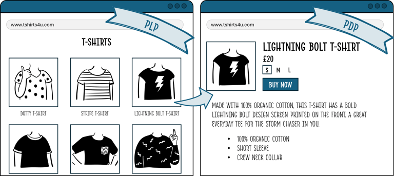
The topic of PLP and PDP is best tackled together. PLP stands for Product Listing Page, so it's the page that lists all the products, and PDP stands for Product Display Page, the page that displays the product information. If you think of a physical store, the store itself, displaying all the goods, is the PLP and the product itself is the PDP.

The Key Elements of PLP
As mentioned, the PLP is the Product Listing Page, which lists all the products available to the customer. Essentially, it is the store layout or gateway to your products.
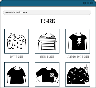
In the above illustration, the PLP is very basic: it just has the name of the category (T-Shirts) and then it lists all the products. This is fine if you have 1 type of product or only a few products to sell. But what if your store has a multitude of products? Or you're selling 1,000 different types of t-shirts? Your customer will not have the patience to scroll through all 1,000 types, so you need to provide a way for them to find the product they want. And you do this through categorisation.
Categorisation
Categorising your catalogue of products should not be done solely for the purpose of PLP display (as it should be done for your own reporting and store maintenance, but that's for another time), but it is certainly one of the key reasons to do so.
Imagine the frustration if all you want to see are T-Shirts, but the page includes products such as Hoodies, Sweaters and Dresses. There is so much stuff to filter through, so you end up just throwing your hands up in frustration and exiting the page. By splitting your products into logical categories, it helps narrow and focus the assortment your customer is seeing, so they are not inundated with irrelevant products. By showing the customer exactly what they're looking for, it makes the shopping journey easier and more enjoyable, thus is more likely to result in a purchase.
Everything can be categorised, even if you think that is already the most granular you can go. T-Shirts is a category within Clothing, but it can also be further categorised (subcategorised) into sleeve length, neckline, colour etc. The key is to pick the categories that are relevant: there's no point creating a subcategory of Glitter if this is not a relevant design description for your collection.
You also need to be careful not to show too many categories to your customer: it makes sense to show them the category of T-Shirts, and maybe even the subcategory of Sleeve Length, but if you then break the page down further into Graphic Design, Slogan Design, Block Colours etc, it becomes too granular and can be confusing and frustrating for the customer.
Categorisation is good practice even if your store only has a few products to sell, because as your business grows, your assortment grows, and the more products you offer, the more vital it is that you categorise your offering into logical, sensible groups. It is much easier to do it from the get-go than to have to do this retrospectively. I can attest to this because I've participated in catalogue recategorisation at the point of business expansion, and the amount of retrospective work we had to do was extensive and painful. If you don't have enough products to warrant onsite categorisation, you don't have to display them on your website; you can keep this hidden in the backend.
Filtering
Once you've categorised your products, your customer needs to be able to filter through the categories you've created. Traditionally, this was done on the left hand side of the PLP, known as Left Hand Navigation. These are the little checkboxes on the left side of the page that help filter down the page. This is still the most common practice, but recently some stores that are moving the navigation to the top of the page as a banner, as that is what the eye is immediately drawn to. Some stores have also combined the two together: by highlighting their bestselling categories or subcategories in the banner, and still keeping the left hand navigation to allow for filtering on smaller but still-important categories such as size and colour.

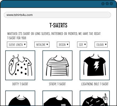

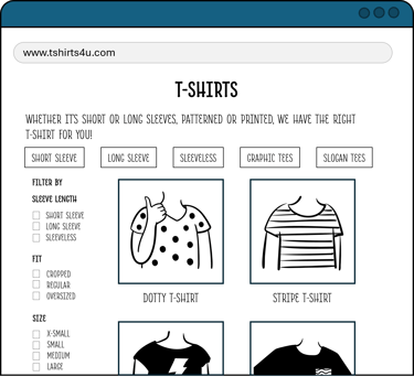
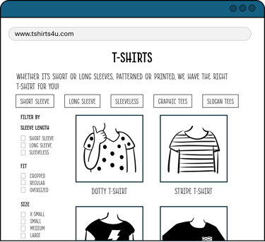
As with most cases, there are pros and cons to each design, and much it can come down to personal preference. However, with the above examples, you can immediately see that having some form of filtering helps your customer narrow down to what they want. Sometimes it can even inspire additional purchases: if they were only looking for short sleeve t-shirts, but see the filter for long sleeves, it might pique their interest and they begin to browse, and eventually result in an additional purchase.
Additional Tips
Adding text descriptions to your PLP help summarise what the customer should expect on that page. This also helps with your SEO as it describes the products on offer to the crawlers, who are programmed to process text as opposed to images
Visual banners (images in the banner filters) can help boost engagement, as the human brain processes images 60,000 faster than text, thus images help customers see the message you're conveying quicker
Breadcrumb navigation is a common tip to add to the PLP. This is when there are arrows or signs to show how the customer got to that page, such as Home > Clothes > T-Shirts. Inspired by the story of Hansel and Gretel, breadcrumbs are useful for SEO crawlers, and also for customers to understand the site setup and easily navigate to the category above if they're inclined. However, this is arguably more and pertinent to big webshops with large assortments and deep categorisation
The Key Elements of PDP
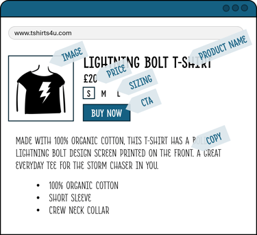
Meanwhile, PDP stands for Product Display Page. This is the page of the product itself, and it displays the images and information the customer needs.
In theory, the elements of a good PDP are pretty straightforward. However, as they say, the devil is indeed in the detail!
Product Name
First thing's first, the customer needs to know what they're looking at. The product name needs to be clear and concise, and free of any industry-specific that the average customer won't understand, but also descriptive enough for the customer to get immediately what it is. It's not enough to just call something "T-Shirt". What if you have 50 different designs on your page? All 50 of them will just be called "T-Shirt", making it hard to distinguish between the different designs. The product name will also show up on PLP, so make sure it's not too long. We would recommend 3-5 words in the product name, to ensure it's long enough to be descriptive, but short enough to ensure the name is not truncated.
Image
The next most important element is the product image. One of our favourite stats is that the human brain processes images 60,000 times faster than text, so the customer's eye is drawn to the image before the name. It is important that your leading image shows the product you're selling clearly, at an angle that showcases the product's selling point. For most items, you should have at least 3 images (front, back, detail for apparel and accessories), with the sweet spot being 4-6 images in total. Since the customer cannot physically see or feel the product, you need to show them as much of the product as possible online.
Price
The customer knows what the product is called, they know what it looks like, the next thing they'll want to know is how much it costs. In the UK, it is vital that your price includes any VAT calculations, and that the price stays consistent throughout the purchase and checkout process. There is nothing more frustrating than thinking something is one price, only to find 20% tacked on when you get to putting your card details in.
(This is potentially different for services, but in this case, we are just referring to eCommerce sales of product)
Make sure as well that the price you're listing is truly the price you want to sell the product at. Imagine listing your hand-embroidered jacket online but you accidentally miss out the 0... The jacket sells like hotcakes within minutes, before you are able to catch your mistake. You're then left with a conundrum: do you recall all the purchases, which results in a bad customer experience and you likely will miss out on future customers? Or do you proceed with the sale, taking a massive hit on your profits, perhaps even making a loss? Neither option is great, so just make sure you triple check your prices before hitting the "list" button.
Sizing
This is particularly relevant for the apparel industry, but of course this applies to any product that comes in different sizes. If your customer can choose different sizes, you need to present all the available sizes so the customer can select the relevant one for them. The sizes should be listed in a logical order, most commonly from smallest to largest, so the customer doesn't miss out on their size because it's listed out of turn.
Copy
Copy is the piece of text that provides more detailed information about the product. If the customer reads the product name, scrolls through all the images, and still needs persuading, this is where the copy comes into play. You should strive to provide as much relevant information as possible, because you never know what will sway your customer. You aren't able to deploy a store assistant the way you can in a physical shop, so your copy needs to answer as many questions your customer might ask. In some industries, this is particularly important and worth investing time in, such as F&B (to declare ingredients and allergens) or Beauty (to declare chemical compositions).
It also serves the purpose of powering your page's findability on search engines. In other words, it helps with SEO. If you're unfamiliar with SEO, read our KISS guide on the topic here.
Copy can be in long form (full sentences) or bullet points. There is ongoing debate as to what is better (some argue that long form is better for SEO and bullet points are better for humans, some say otherwise), but the main thing is just to include copy, whatever your desired format.
CTA (Call to Action)
CTA stands for Call To Action, because it often describes a button or an element that calls the user to perform a particular action. On a PDP, the most common CTA is the Add to Basket button, where your customer selects their desired size and adds it to the basket to be purchased. The CTA should stand out on the page, so it is easy to find on the page. By making it different to the rest of the text, the customer knows that there is something different about those words. The human brain is also programmed to click on a button, and there is an argument to be had that you can subconsciously encourage your customer to purchase by making the purchase button stand out.
Additional Tips
There are many other features that can be added to the PDP, from colour grouping (showing different colours of the same style) to cross-selling (selling related products, such as the matching knickers to the bra). The possibilities are endless!
If you want to learn more about how to optimise your PDP to increase your conversion (converting visits to purchases), read our KISS guide to CRO (Conversion Rate Optimisation.

TL;DR Conclusion
PLP stands for Product Landing Page, which is where the customer lands to view all the products available to purchase
PDP stands for Product Display Page, which is the page that describes the particular product on sale
Every store may have their own design and format of PLPs and PDPs, but there are some key fundamentals that help smooth the purchase journey. By removing friction and frustration, it can improve your conversion rate (converting browsing visitors to purchasing customers)
At Mpowering Solutions, we can perform a CRO Audit on your webshop, to highlight any pain points that are potentially hindering customers from completing their checkout
