
KISS Series: CRO
In this KISS (Keep It Super Simple) Series, we simplify CRO (Conversion Rate Optimisation), so you understand what you need to convert a view to a purchase.
As part of our mission to educate small business owners with digital knowledge, we have created the KISS Series (Keep It Super Simple), where we take digital theories and concepts and break them down into bitesize, understandable explanations.
In this post, we break down what CRO means, why it matters and how it works.
Content:


CRO: Conversion Rate Optimisation
Firstly, what does conversion mean? Let's clarify what it means in the context of retail. Conversion is essentially how many visitors a store can convert into purchasing customers. So if 100 people walk into a store, and 40 people purchase, that store has a 40% conversion rate. The formula is below:
Therefore, CRO is how to optimise your business' ability to convert visitors from browsing to purchase.
Conversion rate is widely associated with retail and eCommerce, but in reality, it can be used in any context where you are trying to convert people from action A to action B. So for instance, if your aim is to get people to fill out a questionnaire on your website, your conversion is from getting people who visit your website (action A) to answer your questionnaire (action B). However, in this article, we will be largely focusing on eCommerce conversion, though this is not to say the recommendations can't be applied to industries, as the principles are often quite similar.
# of purchases / # of visitors x 100 = conversion rate %
Reality Check!
The first thing to point out is that bricks-and-mortar physical stores and eCommerce webshops have very different benchmarks for conversion. The aforementioned example of 40% is considered strong for shops, but virtually (pardon the pun!) impossible for an online store.
In reality, the average conversion rate online is anywhere between 2% to 5%, with Shopify benchmarking it at around 2.5% to 3%, and even goes on to say that a 1.4% conversion rate is pretty standard. That means for every 100 people who click on a website, Shopify considers 3 purchases as a strong performance. This may seem abysmally low, especially if you've worked in physical retail before and seen 20% or 30% conversion rates on trade reports. But this is all logical, and it all comes down to...
Differences in traffic: think about the differences in visiting a physical store versus an online store. To go to an actual store, you have to get dressed, physically leave the house and travel to the store, whereas with online, you can log onto your computer or phone and just visit the webshop in a matter of seconds, even if you're in the bath. Therefore, there are way more people virtually visiting a webshop compared to physically visiting a bricks-and-mortar store. This also results in...
Differences in purchasing intent: more often than not, you hit the high street because you are actively looking for something. Even if you're only browsing, you have the intent to potentially purchase something should you like the look of it. With online, however, we often browse online because we're trying to pass the time. Yes, of course there are times when you have the same intent to purchase, but online provides...
Opportunity to compare: it is so much easier to perform price comparisons online than instore. In the days before eCommerce, if you found a pair of shoes you liked but wanted to check if there were cheaper alternatives, you had to walk up and down the high street, enter all the relevant stores and remember which store had what. Then after 2 or 3 stores, you'd just give up and buy it at the original store you saw them, because every store had a different assortment or the prices were the same. With online, you can very quickly and easily check different retailers for better deals. Often people open up different tabs of the same product at different retailers, find the retailer or the price that they prefer and purchase there instead.
Therefore, if you're looking at your store's dashboard and despairing over your single digit conversation rate, don't! This is completely normal, but that doesn't mean you shouldn't strive to continuously better and improve your conversion rate.
Key CRO Fundamentals
We strongly believe every website and webshop should have their own identity, and what works for one may not work for another. However, there are some fundamental rules that almost every webshop should follow or at least draw inspiration from, such as the below:
#1 - Number of High Quality Images
When you're buying a sweater instore, you can feel the fabric for softness, you can hold it up on the hanger and swivel it round to see how it looks, you can see the colour in natural light, you can inspect it up close to see the details of the embroidery. All of this is not possible online. Shoppers are presented with an image on a screen, so it is imperative you provide as much visual information as possible so the shopper can get as close to a 360° view of the garment as possible.
Industry experience has taught me that a garment should have at least 3 images (front, back, detailed), because that is the lowest number of shots to show the key views. In actual fact, the sweet spot of number of photos is 4-6 images, and 7 and above can be seen as overwhelming for apparel consumers. Some industries such as tech may require more images due to their high price points and technological innovations, but on average, 4-6 images provide the customer with sufficient information about the product to make an informed decision.
Furthermore, it isn't just about quantity; it is equally about quality. There is no point putting loads of images if they are blurry or fuzzy and you can't see the product clearly, or if the model poses don't allow for the garment to be seen in a natural position. Zara was guilty of this back in the early days (they have since gotten better, though there is still room for improvement), when they had 4-6 photos of the models were modelling a dress while crouched on a stool, so you were unable to see the dress in full flow. This was such a thing that there is an Instagram account AwkwardZara dedicated to this.
Was this just a great PR ploy to get the online community buzzing? Perhaps. But Zara can afford to do this at the expense of an actual sale; small businesses (or even just regular businesses) can't.
Professional photographers will argue that quality is more important than quantity, while data analysts will argue quantity is more important that quality. I will be very boring and say both are equally important. This is not because I don't want to take a side; it is because I have seen both cases. I have had collections with 6 unenticing photos, and I have had collections with 2 beautiful, high quality photos, and neither of them converted well. The ultimate goal is simple to understand but not always easy to execute: you want to give the customer enough information to inform their decision, while creating an aspirational vision that they want to emulate, and you achieve that with enough photos (to inform decision) of high aesthetic quality (to create aspiration).
I'll leave you with 2 stats to sum this point up: 75% of online shoppers relay on photos to make a decision, and the human brain processes images 60,000 times faster than text.
#2 - Copy information
The visual elements may be #1 on our list, but written copy is a close #2. Copy serves a multitude of functions, one important one is SEO. Search engine crawlers are clever, but they ultimately are programmed to read lines of code (therefore text) as opposed to processing images. So you can have the most beautiful images within the 4-6 photo guideline, but if you don't accompany those photos with actual descriptions of the product, Google and other search engines won't be able to understand what you're selling, and your products may not end up getting listed when potential customers type the query into the search engine.
(If you are unfamiliar with SEO, read our KISS guide to SEO; if you are unfamiliar with the term "copy" and want to learn more about PDPs (product display pages), read our KISS guide to PDPs)
If we put aside the bots and crawlers for a second, copy is the vital for your very human customers to learn more about the products you're selling. Consumers nowadays want more and more information, and it also helps to establish your authority and authenticity in the marketplace.
The ideal combination of copy is both in long form and bullet points. Long form copy with complete sentences give you the opportunity to speak to your customers as if you were selling them the products in person, and thus persuade them to convert from browsing to purchasing. It also allows you to get into complex descriptions if your product requires, such as details about the chemistry behind your lotion, or telling the inspiration story of your collection's design. Meanwhile, bullet points break up information into easy-to-read, digestible points, so any customers in a rush or who have reading difficulties or a shorter attention span can quickly see what the key selling points are for your product.
Nonetheless, it is vital to have some form of copy, whatever form you prefer. Compare the two examples below. The version with the copy not only provides more information to persuade the customer to purchase, it also adds a level of authority to your business and makes your brand trustworthy.
If you can't tell what the photo is meant to be selling, neither can your customer
Photo credit: AwkwardZara
There are debates as to what better serves what function, but the answer is not definitive. From previous experience, long text tends to help with SEO, while bullet points tends to help human users as they are quick to consume. But equally there are human users who love to read paragraphs of text, and SEO can also read bullet points, so there isn't a right or wrong answer here. So why not cover your ground and do both? There are no real downsides to that.
#3 - Clear CTA (Call To Action)
Call To Action are indicators such as buttons or icons that, well, call people to action, such as adding product to basket. The presence of a CTA is perhaps obvious enough, but the format is equally as important, because it signals that that is an interactive button. Consider the examples below.
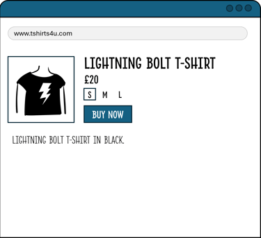

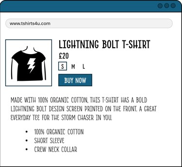
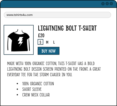
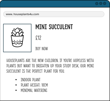
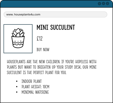
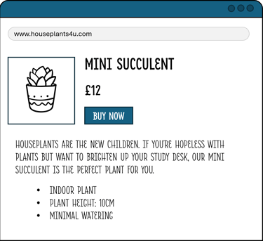
Notice the "Buy Now" button. In the unformatted version, it looks like the rest of the text, whereas in the formatted version, it is immediately visually obvious. Of course, the formatting doesn't have the be exactly like the graphic, but formatting is important for the following reasons:
Clear functionality: even if you don't speak the language of the shop, by having the button look distinct, it stands out and immediately calls out that that text has a different functionality to the rest of the page
Direction: by having the desired action signposted, it catches the customer's eye and gives them direction on what that page's function and purpose are, and ultimately what is their expected action
Psychology: people are more likely to do something if you prompt them to. There's a reason why we're drawn to big, bold, shiny things. By highlighting the Buy Now button, it subconsciously encourages people to interact with it, thus persuading them to buy
Your CTAs should work for whatever theme and design your webshop and brand have, but make sure it is clear and obvious to the customer what you expect them to do on the page, otherwise they might miss the cue.
There are many other things you can show on your PDP to increase conversion, but these are the must-have foundations for a strong starting point.
TL;DR Conclusion
Conversion rate is the percentage of people you convert from browsing to purchasing, and O stands for optimisation, therefore CRO stands for Conversion Rate Optimisation: the act of optimising and improving your webshop's conversion rate
Conversion is most often used in the context of retail, but it can refer to any website or function that requires people to convert from action A to action B
CRO fundamentals are theoretically simple: provide the customer with as much information as possible, both written and visually, so they can make an informed decision
However, small businesses may not always have the time, budget or capacity to produce high quality content such as strong imagery and copy to improve their CRO
At Mpowering Solutions, we can perform a CRO Audit on your webstore to check if there are any functionality or design issues that could be hindering your store's performance
We provide copywriting services if you struggle to write compelling, enticing copy to attract customers, or if you simply don't have the time to type it all out. We will also ensure your copy is SEO optimised
We also work with content creators to help with content creation if you are struggling to create appropriate PDP imagery. Let us know your needs and budget and we can see how we can help

